
The Market's Dead Zone
Ask most people when the worst time to own stocks is, and they'll point to the scary moments. Eighteen years of data says that's not it.
The five regimes
Any given day, you can drop the market somewhere on a line from Risk-On to Risk-Off. Where it lands depends on a cross-asset composite of eight signals: credit stress, equity volatility, bond volatility, currency carry, commodity growth, sector leadership, defensive rotation, and the yield curve. Each one gets measured against its own history, and no single one runs the show. What matters is whether they agree.
That gives you five regimes, from full Risk-On through Neutral down to full Risk-Off.
The question is simple. When the market has been in each regime before, what happened next, over the following one, three, and six months? This is a record of what's already happened, not a guess about what's coming. Base rates, not forecasts.
What the data shows
Line up the regimes by their typical return and you don't get a clean slope from bad to good. The low point is Mildly Off, the mild-stress regime just under Neutral. Over the three months that followed, the market's typical return was about 1.7%, and it rose 61% of the time. Every other regime did better, and this holds at one, three, and six months out. Mildly Off is the weakest at every horizon. For single stocks, see how US stocks have done in Mildly Off markets, ranked.
That's a little strange when you think about it. Mildly Off isn't where the market looks dangerous. It's where it looks slightly off. A bit of credit widening, a bit of volatility, nothing that sets off alarms. And yet that's been the weakest spot.
Why? We don't know yet. It's a slow bleed rather than a crash, and our first guess at the reason, that mild stress means things are getting worse and the market hasn't caught up, didn't survive its own test. See We tried to break it, below.
The flip side
The second part sits right next to the first. The scariest regime, full Risk-Off, has been among the strongest. Over the next three months its typical return was about 6%, the highest of any regime at that horizon, and it rose 78% of the time.
One caveat worth being upfront about: Risk-Off is rare, so that number rests on a small number of episodes. Treat it as suggestive, not settled.
Still, it sounds backwards until you think about what Risk-Off really is. By the time the market gets there, it's already fallen, everyone's scared, and things are oversold. That's exactly where bounces come from. The moment of peak fear has, on average, been followed by a recovery, not more pain.
So you end up with a shape that's worth sitting with. The extremes have beaten the middle. Full Risk-On and full Risk-Off have both done better than the murky regime in between. The market's paid off when the picture is clear, in either direction, and let you down when it's muddy.
What this won't tell you about a single stock
For any one stock, the regime is usually a minor input. The market-level pattern above is solid, but it does not carry over cleanly to a single name.
Take two big names. Run MSFT through the same analysis and its returns barely move across regimes. The gap from its weakest regime to its strongest is under two points, tighter than the market, and small enough to sit inside the sampling noise. For MSFT the regime barely moves the needle. The stock's own trend is doing the work.
Run AAPL and the spread is wider, roughly double MSFT's. But a single name has only a handful of independent stretches in each regime, so even that wider spread is too noisy to call a real regime effect. AAPL looks more regime-sensitive than MSFT, and it might be, but the history is too limited to say so with confidence.
So the honest takeaway for single stocks is narrow. The regime describes the market a stock is trading in. It does not describe the stock. For any one name the independent sample is small and the stock's own trend dominates, so the regime is a minor and noisy input rather than a clean signal. It is not a buy or sell trigger on any one ticker. Anyone telling you a stock is a buy because the regime looks good is stretching past what the data supports.
How it's measured
A couple of notes on the build, because this part matters.
The regime comes from a cross-asset composite of eight separate signals, each one normalized against its own history and rolled into a single daily reading.
The returns are measured over past periods that do not overlap, and that detail matters more than it sounds. If you measure every overlapping period, you get thousands of data points that aren't really independent, because they share most of the same days underneath. That makes it look like you have more evidence than you do. The honest count is how many independent past periods you've actually got. When a regime has fewer than ten, the number gets hidden instead of shown, because that's too little to trust. A stock that just listed will read too little history across most regimes. That's the data being honest about what it can back up.
It's also why the Risk-Off figure above carries a caveat. It clears the bar to show, but it's built on fewer episodes than the calmer regimes, so the range around it is wide.
We tried to break it
The five regimes are cuts on a daily score. So the first question is whether the dip lives in the score, or only in where the cuts fall. Take every day since 2008, place it by that day's percentile, and draw a smoothed curve of the return over the next three months. No regimes, no cuts. The curve still dips. It bottoms near the 23rd percentile, inside the mild-stress readings, and the same curve drawn from mid-2013 on dips in the same place.
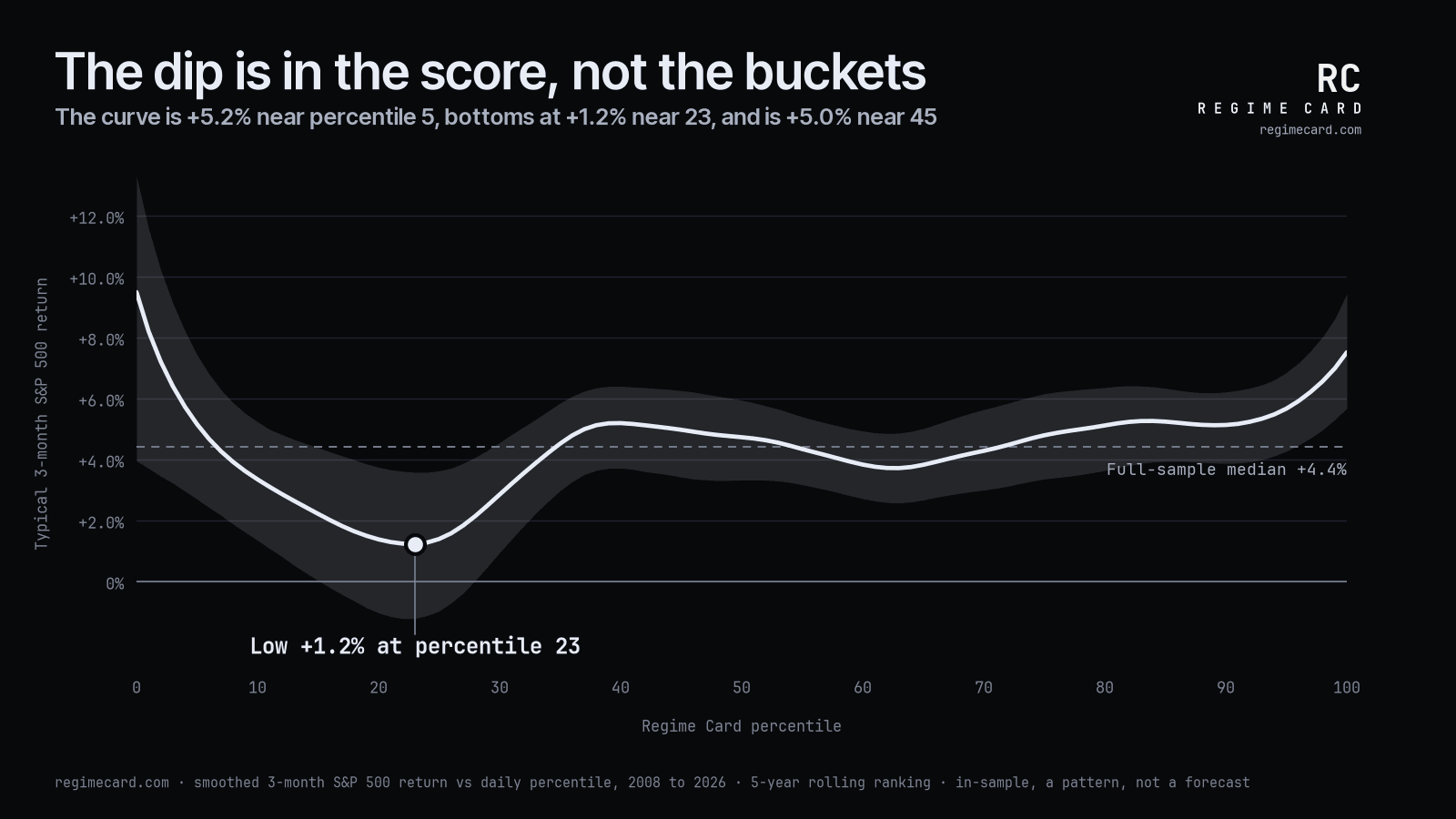
Our first explanation, when this was published, was that mild stress is weak because things are getting worse and the market hasn't caught up. We wrote that test down before we ran it. Split the mild-stress days by whether the score had been falling into them, or climbing out of a worse reading. The two halves came back about the same, and both were weak. So that was our own guess, and it was wrong. What's mattered is the level of the score. The direction it came from adds nothing we can measure.
So here's where it lands. There's a level effect: a stretch of the score, around the mild-stress readings, where the next three months have been weaker than anywhere else on the dial. It's real, it's modest, and it's clearer after 2013 than before. It's also measured on the past, and that's the one weakness of every test here. The data behind it stops in July 2026. Every daily reading since September 2026 is locked into the public record as it's published, so everything from here on is out of sample. That's what decides it.
Methods note
The mild-stress figure rests on 39 non-overlapping 3-month periods. In resampling, Mildly Off was the weakest of the five regimes in 97.6% of draws when whole regime episodes were resampled, and in 95.2% when 63-day blocks were. The dip holds from a 2013 start. The direction and curve tests were written down, with their pass rules, before they were run. Everything here is measured in sample.
Variants tried: the five regimes; the curve with no regimes, at three smoothing widths (5, 10 and 15 percentile points) and with a running typical-return smoother; two direction splits (the regime before each mild-stress run, and the score against its own reading 20 trading days earlier); four bins by trading days since the last Mildly On or Risk-On reading; three start dates (2008, 2009 and 2013); and block lengths of 63 and 126 trading days, and the mean episode length. The curve uses no regime labels, so the stress gate plays no part in it. The dip is there in every variant. The direction found no support in any of them: in the bins, the freshest mild-stress days did best, the opposite of the story.
Base rates, not forecasts
One last thing, because this kind of analysis is easy to take the wrong way.
This is a description of what's happened, not a prediction of what will. A typical past return isn't a guarantee, and the spread around it is wide. Any single instance can land nowhere near it. Markets change too. A pattern built on the last twenty years might not hold for the next twenty, and 2008, 2020, and 2022 each rewrote part of the playbook.
Use it as context for the environment you're in. Not a forecast, and not a trade signal.
The tool updates daily. You can check the current regime and the base rates for the market or any stock at regimecard.com/returns. The scorecard on the history page is the daily-updated version of this finding, scored over the week and the month after each reading.
How this reading differs from a stock sentiment gauge: CNN's Fear & Greed Index vs Regime Card.